Skills Capacity and Demand Planning Dashboard
The Skills Capacity and Demand Planning dashboard enables you to view available capacity by skill/certification, using data derived from the Project Reporting, Utilization Results, and Resource Skills datasets. This dashboard is designed to be embedded in the PSA Resource Management workspace. For more information, see Embedding PSA Analytics Dashboards in a Lightning Page.
Data displayed in this dashboard can help you address the following operational and strategic business questions:
- Do you have the right resources to deliver your project, based on their skillsets?
- Do your resources have the necessary skills to meet demand?
- How many resources do you have for a particular skill set, and what is their availability?
- Should you fulfill demand with internal or external resources?
- Where should you invest in longer-term development and growth, based on reporting trends?
Skills / Certification Ratings
In order to display a skill in the Skills Capacity and Demand Planning dashboard, you must have at least one resource with a skill / certification rating of zero or higher in your PSA data environment for this skill. For more information, see
Viewing Capacity for Multiple Skills
We recommend that you use this dashboard to examine demand for single skills, and how many hours you have for resources with that skill.
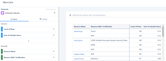
Calendar, assigned, and held hours are repeated for each resource skill or certification related to a resource.
For example, you might have a scenario in which you want to run two different projects requiring two different skills for a particular month. You might have a resource with the required availability in hours for two different skills. But the dashboard would not indicate that this resource would be unable to commit the same amount of hours simultaneously for two different projects, using their two different skills. In this case, we recommend that you use the view by Skill + Resource grouping in the dashboard to indicate where resources are listed under multiple skills.
We recommend that if you have two projects running at the same time that require two or more different skills, and the dashboard displays availability for both skills, that you check that you do not commit the same resource twice for their skills.
This repetition occurs when grouping by Resource Skill / Certification using data derived from Project Reporting and Utilization Results datasets. For example, see the grouping shown in the lens derived from the Utilization Results dataset below.
Click the image to expand it.
Skills Capacity and Demand Planning Dashboard Elements
The Skills Capacity and Demand Planning dashboard contains the following pages, tables, local filters and components:
|
Chart Type |
Description |
|---|---|
| Bar chart | Displays a bar chart indicating the distribution of capacity by skill or certification as a percentage value. |
| Line chart |
Displays a line chart indicating the movement of capacity by skill or certification as a percentage value over time. You can filter the data displayed in the bar and line charst with the following drop-down selectors. To edit these questions, see Configuring Dashboard Questions.
|
| Heatmap chart |
Displays a heatmap indicating the distribution of capacity by skill or certification. This chart is faceted by the bar and line charts displayed above it. You can filter the data displayed in this chart with the following drop-down selectors:
You can also apply the following time groupings to the data displayed in the heatmap chart:
|
| Table |
Displays a table indicating the availability of resources. This table is faceted by the heatmap chart and comprises the following columns:
|
Configuring Dashboard Questions
You can edit the default questions displayed in the bar and line chart drop-down selectors. For example, you might want to change the wording of a question, or the data displayed in response to a question.
To do this, perform the following steps.
- In Analytics Studio, navigate to the app containing the Skills Capacity and Demand Planning dashboard you want to edit.
- Click Edit to enter edit mode.
- Double-click the question component above the bar and line charts.
- Click Continue.
- In the Questions modal that opens, amend your required questions. Available options include:
- Text display. Edit this cell to amend the wording of a question. This does not alter the data displayed by the question.
- Number limit. Edit this cell to amend the number of bars displayed in the bar chart.
- Text order. Use the asc or desc value in this cell to control whether values are displayed in ascending or descending order in the dashboard.
- We recommend that you do not change the Text measure or Text order cells. Altering the values in these cells might prevent data from displaying correctly in your dashboard.
- Click Done.
